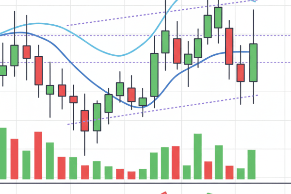
If you've ever looked at a financial chart, you've likely encountered the colorful bars and lines of a Japanese candlestick chart. More than just a visual tool, candlesticks are the cornerstone of modern technical analysis. Each candle tells a detailed story about the battle between buyers (bulls) and sellers (bears) over a specific time frame. Learning to read them is like learning the language of the market.
The Anatomy of a Candlestick
Before interpreting patterns, you must understand the four key data points that make up every single candlestick:
- The Open: The price at the beginning of the period.
- The High: The highest price reached during the period.
- The Low: The lowest price reached during the period.
- The Close: The price at the end of the period.
These four elements form two main parts: the body (the thick part) and the wicks (the thin lines extending from the body). The body represents the range between the open and close price. The color of the body tells you the market's direction: typically green or white for a bullish candle (close higher than open) and red or black for a bearish candle (close lower than open).
Key Single Candlestick Patterns to Know
Even a single candlestick can provide powerful insights into market sentiment. Here are a few essential patterns to recognize.
1. Marubozu
A Marubozu is a candle with a full body and no wicks. A bullish (green) Marubozu signals strong buying pressure from open to close, while a bearish (red) Marubozu indicates dominant selling pressure. It's a clear sign of momentum.
2. Doji
A Doji occurs when the open and close prices are virtually the same, resulting in a very thin body that looks like a cross. This pattern signals indecision in the market—neither bulls nor bears could gain control. It often precedes a potential reversal or trend change.
3. Hammer and Hanging Man
These two patterns look identical but have different implications based on their context. Both have a small body at the top and a long lower wick. A Hammer appears after a downtrend and suggests a potential bullish reversal. A Hanging Man appears after an uptrend and warns of a potential bearish reversal.
Powerful Dual Candlestick Patterns
When two candles are read together, they can form even more reliable patterns. One of the most popular is the Engulfing pattern.
The Engulfing Pattern
This is a strong reversal signal. A Bullish Engulfing pattern occurs when a small bearish candle is followed by a larger bullish candle whose body completely "engulfs" the previous one. This shows that buyers have decisively overpowered sellers. The Bearish Engulfing is the opposite and signals a potential top.
Of course, no pattern is foolproof. It's crucial to test your ability to spot these patterns without financial risk, which is exactly what a demo account is for. It allows you to practice in real market conditions with virtual funds.
Putting It All into Context
Recognizing patterns is only half the battle. True mastery comes from understanding their context. A bullish pattern is far more significant if it appears at a major support level than if it appears randomly in the middle of a range. Always consider the surrounding price action, trend, and key support/resistance levels.
Furthermore, combine candlestick analysis with other tools like volume indicators or moving averages for confirmation. Remember that even the best analysis is useless without a disciplined approach. Every decision should be guided by your risk management strategy to protect your capital from inevitable losing trades.
Conclusion: Learn to Listen to the Market
Candlestick charts are a powerful tool for any trader. They provide a visual, intuitive way to gauge market psychology and identify potential trading opportunities. By learning the basic anatomy and key patterns, you can gain a deeper understanding of price action and make more informed trading decisions. Start small, learn to recognize the most common patterns, and always consider the context.